
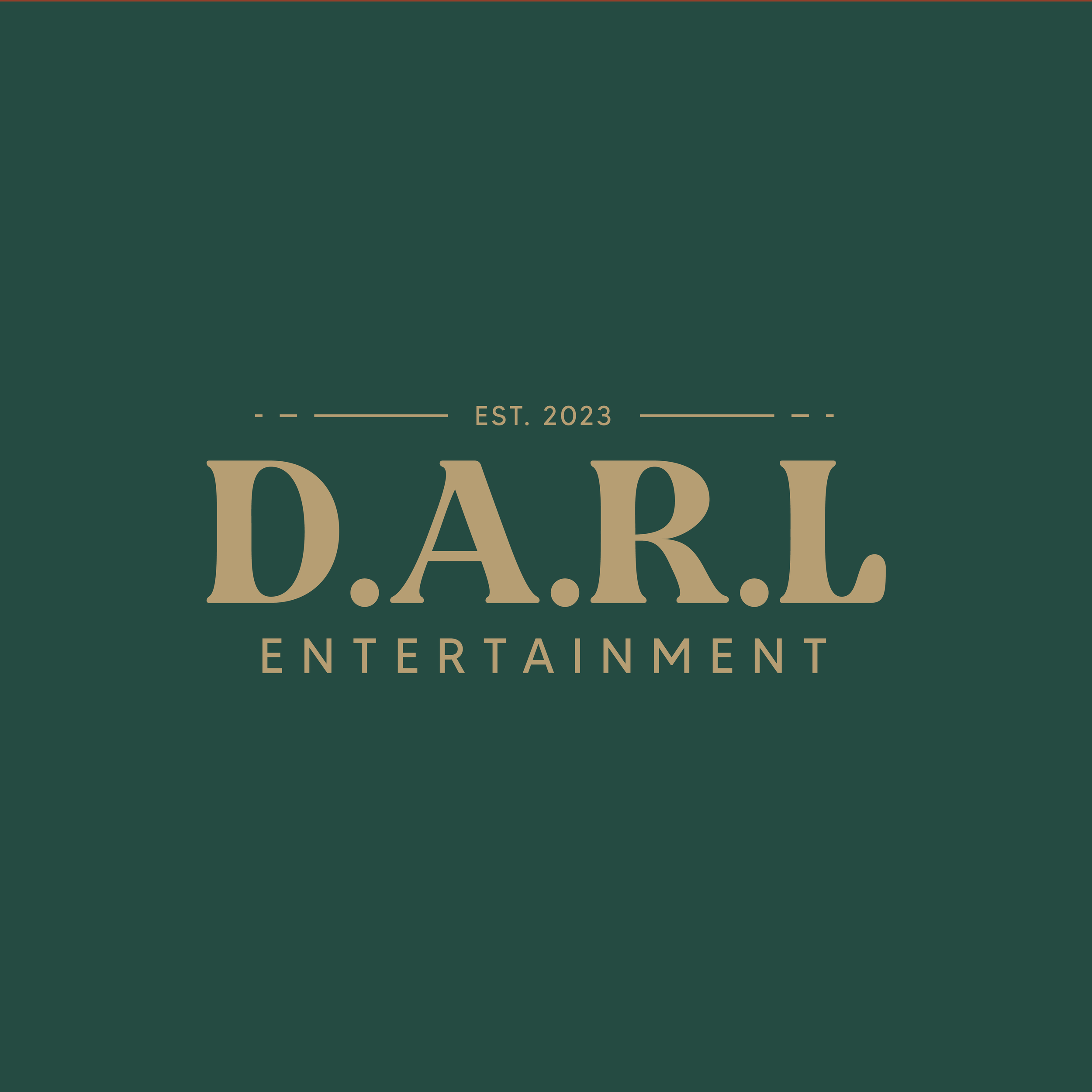
D.A.R.L Entertainment
Logo design and branding guide

D.A.R.L Entertainment is a talent agent, that specialises in finding/managing talented individuals to perform and travel the world on cruise ships.

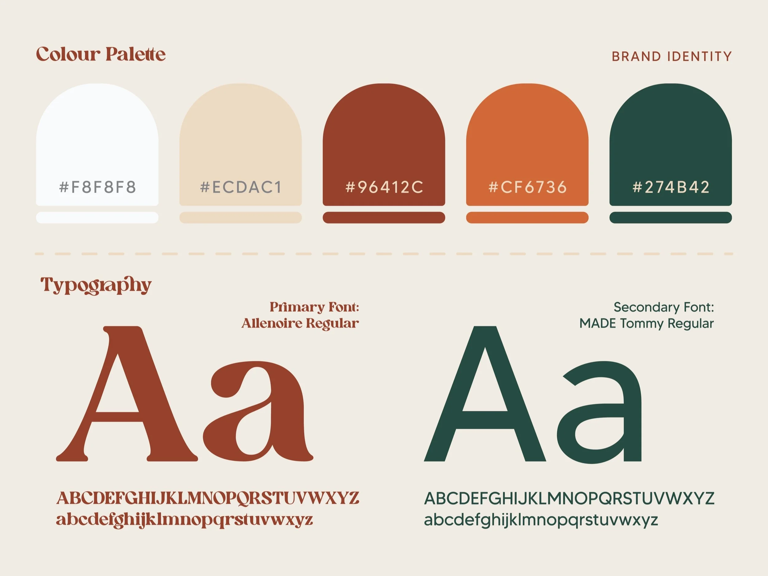
The choice to opt for an earthy colour palette for this logo design was deliberate, intended to convey a strong connection to Australia and the client's down-to-earth attitude and personality. Drawing inspiration from the natural hues of the Australian landscape, incorporating tones of terracotta, eucalyptus green, and sandy beige helped imbue the logo with a sense of authenticity and grounded personality. Through these earthy colours, the design seeks to evoke a sense of warmth, simplicity, and approachability that aligns perfectly with the client's values and identity.
I delivered a whole range of variations of the logo in the various colour palette with the foresight that she may differentiate her business and clients into categories. e.g. dancers, singers, musicians etc.
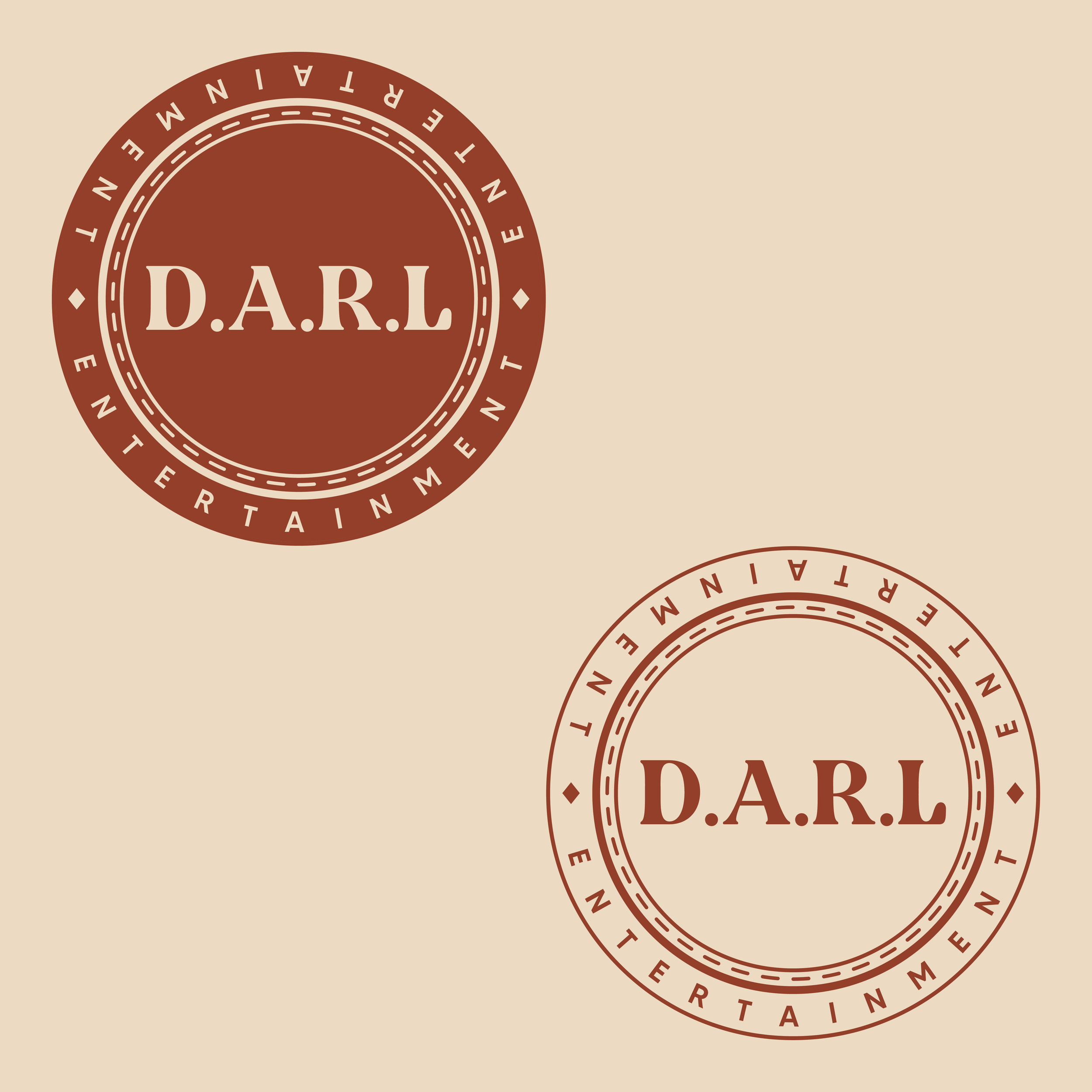
I wanted to create a badge icon that resembled a stamp and could be incorporated into the clients invoices, business cards or social media.

