POD Tiny HOMES | Terry O’Hagan
Logo design & Branding Guidelines

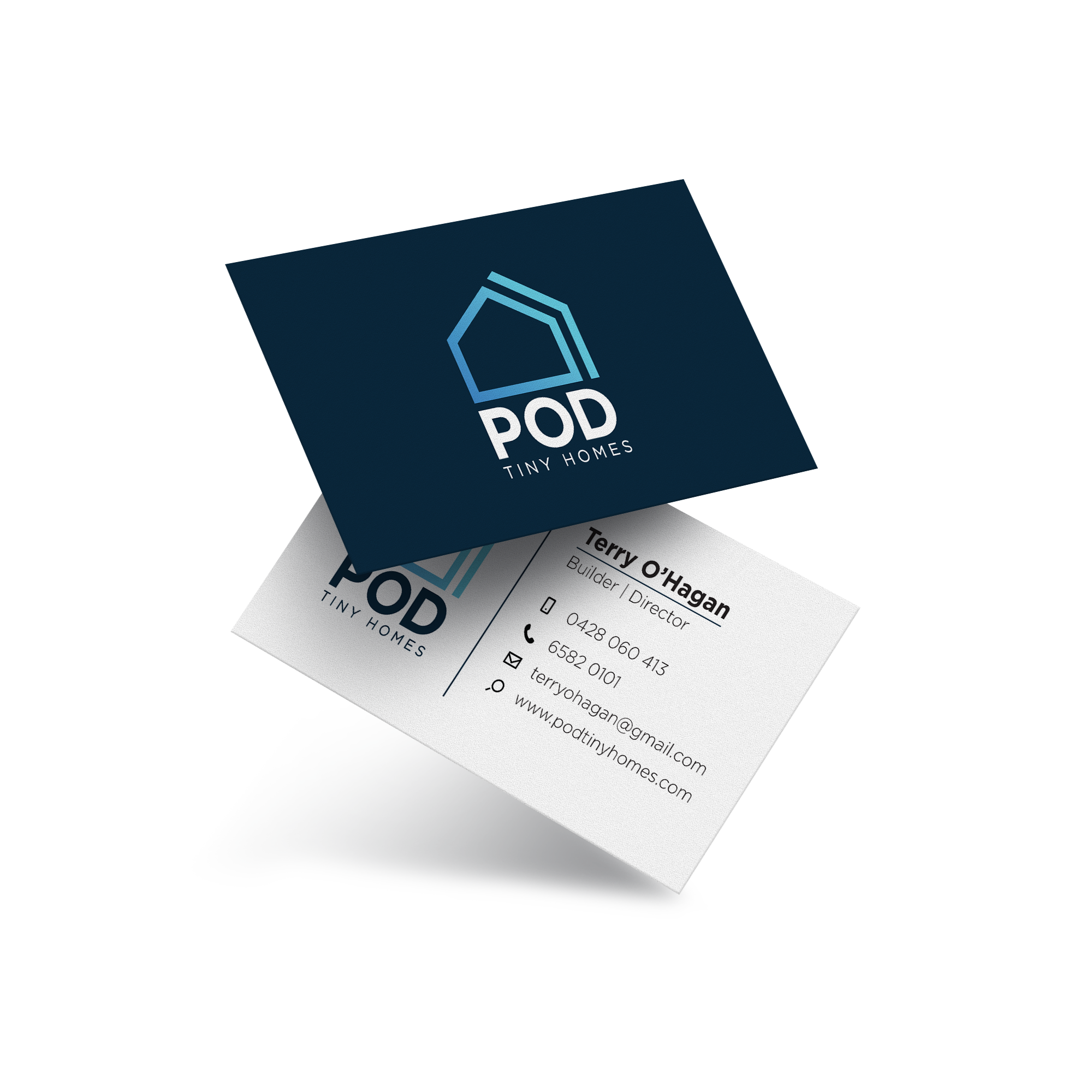
POD Tiny Homes logo, the decision was made to create a sleek, minimal, and professional design. As the client is a builder, the client's logo needed to convey a sense of craftsmanship and attention to detail while also appearing modern and approachable. The sleek and minimalistic approach was chosen to ensure the logo would be versatile and easily recognizable across various marketing materials and platforms. By focusing on simplicity and professionalism, the final logo for POD Tiny Homes successfully reflects the high-quality work and expertise of the builder.

The client's goal is to enhance the value of their current residence by incorporating either a cost-effective standalone granny flat or an affordable tiny home onto a small parcel of land they own. This strategic addition not only offers the potential for extra living space but also presents an opportunity to increase the overall worth and functionality of the property. Through thoughtful planning and execution, the builder aims to create a versatile and valuable living solution that harmonises with the existing home while maximising the available space.

Secondary Logo
Horizontal secondary logos are crucial elements for brand recognition and versatility. When the primary logo doesn't fit or the design space is limited, a well-crafted horizontal secondary logo steps in seamlessly. These logos maintain brand consistency while adapting to different layouts and applications. Their simple yet effective design ensures instant recognition, making them a valuable asset in any brand's visual identity toolkit.

Dark Variation
Secondary logo for when it needs to be displayed on a dark background.


Professional uniform design for builders and contractors. Helps to maintain a polished and cohesive appearance at work sites. A standardised dress code not only creates a sense of belonging and professionalism but also ensures safety and easily identifies the workforce on site.

Distinct coloured uniforms help differentiate workers from management, establishing hierarchy and aiding communication. This practice enhances operational efficiency, order, and workflow, clarifying roles and promoting professionalism and unity within the organisation.